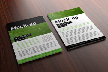
In the vibrant world of graphic design, color is a language in itself, capable of conveying emotions, setting moods, and creating visual harmony. The choice of frame color is a crucial element that can either enhance or alter the overall impact of a design. This blog post explores the specific benefits of using flyer mockup in graphic design, focusing on the pivotal aspect of “Testing Design Compatibility with Various Frame Colors.”
Color Harmony and Contrast
Flyer mockups provide graphic designers with a digital playground to experiment with different frame colors and assess their impact on color harmony and contrast within the design. The right frame color can enhance the overall color palette, creating a harmonious composition, while strategic contrasts can draw attention to key elements within the design.
Adapting to Brand Color Schemes
For designs associated with a brand, maintaining consistency in color representation is crucial. Flyer mockups allow designers to test how different frame colors align with established brand color schemes. Consistent color choices across various materials contribute to a cohesive and recognizable brand identity.
Creating Visual Depth and Dimension
Frame colors play a significant role in creating visual depth and dimension within a design. Flyer mockups enable designers to experiment with frame colors that enhance the perception of depth. Whether it’s a monochromatic scheme for a sleek and modern look or contrasting colors for a dynamic visual impact, the right choice elevates the overall design aesthetics.
Highlighting Focal Points
Strategic use of frame colors can draw attention to specific focal points within a design. Flyer mockups empower designers to assess how different frame colors highlight key elements. By choosing frame colors that complement and enhance the focal points, designers guide the viewer’s gaze to the most important aspects of the composition.
Evaluating Emotional Impact
Colors evoke emotions, and the frame color contributes to the emotional impact of the design. Flyer mockups allow designers to test how different frame colors influence the emotional response to the artwork. Whether it’s a calming effect with muted tones or an energetic vibe with bold colors, the frame color sets the emotional tone of the design.
Ensuring Accessibility and Readability
In designs with text elements, frame colors play a crucial role in ensuring accessibility and readability. Flyer mockups enable designers to assess how different frame colors impact the legibility of text. This consideration ensures that the chosen frame color not only enhances the visual appeal but also prioritizes clear communication.
Adapting to Design Themes
Different design themes call for varied color palettes. Flyer mockups provide designers with the flexibility to experiment with frame colors that align with specific design themes. Whether it’s earthy tones for a natural theme or vibrant hues for a playful concept, designers can tailor their choices to complement the thematic elements of the artwork.
Client Visualization and Approval
When presenting designs to clients, showcasing different frame color options is instrumental. Flyer mockups aid designers in visually communicating how each frame color impacts the overall presentation. This transparency facilitates client collaboration, allowing clients to make informed decisions based on the emotional impact and visual appeal of different frame color choices.
Conclusion
In the kaleidoscopic landscape of graphic design, the meticulous consideration of frame colors through flyer mockups is an art that adds depth, emotion, and visual harmony to the composition. Through testing color harmony and contrast, adapting to brand color schemes, creating visual depth, highlighting focal points, evaluating emotional impact, ensuring accessibility, adapting to design themes, and facilitating client collaboration, flyer mockups contribute to designs that not only captivate the eye but also resonate on an emotional level. The chromatic symphony created by thoughtful frame color choices ensures that graphic designs stand out with a visual impact that is both striking and emotionally resonant.
| Author | Mockups Design |
| File Type | .psd |
| Layered | Yes |
| Smart-Object | Yes |
| License | Commercial Use |