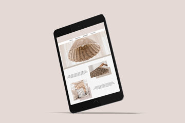
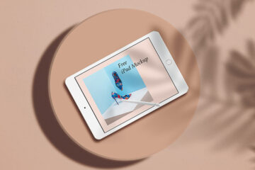
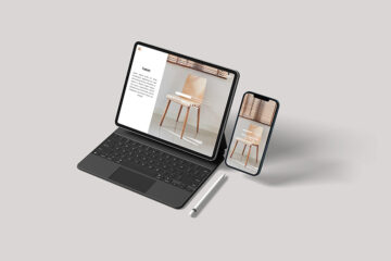
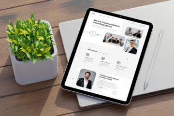
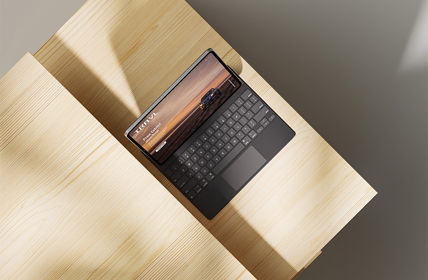
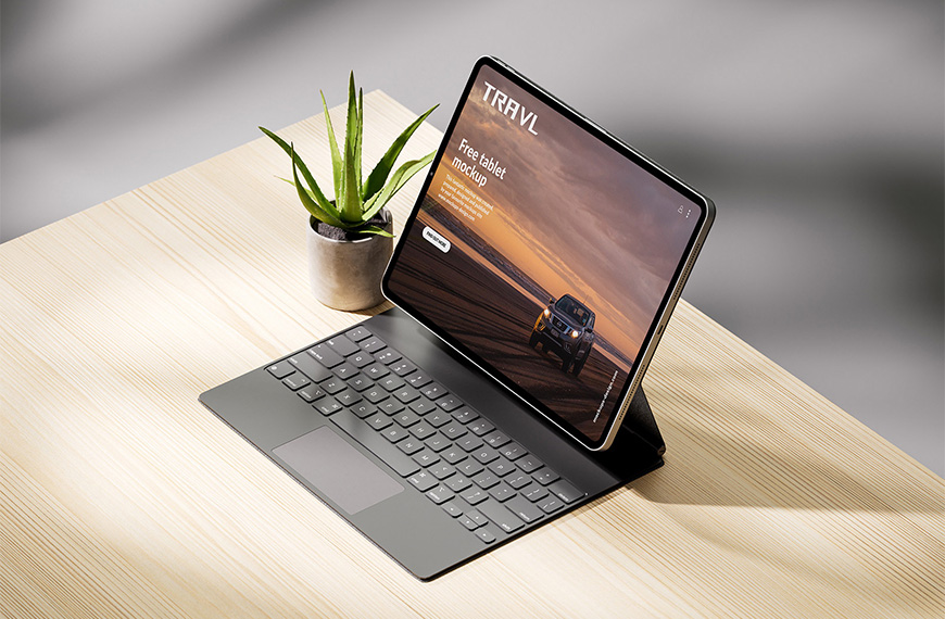
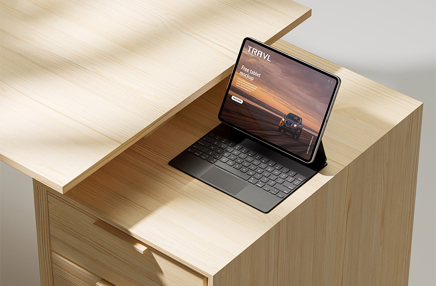
In the realm of graphic design, precision, and presentation go hand in hand. Tablet mockups stand as indispensable assets for graphic designers, offering a glimpse into how their creations will manifest on portable devices. However, one of the critical aspects of tablet mockups lies in their adaptability across various screen sizes. In this article, we delve into the significance of adapting designs for different screen sizes within tablet mockups for graphic designers.
In today’s digital landscape, diversity in screen sizes is the norm rather than the exception. From compact tablets to larger models, each device offers a unique canvas for designers to showcase their work. Adapting designs for various screen sizes ensures that the visual integrity and user experience remain intact across different devices.
The customization for different screen sizes within tablet mockups is paramount for several reasons:
User Experience Consistency
Maintaining consistency in the user experience across different screen sizes is essential for ensuring usability and engagement. Designers must meticulously adjust layout, typography, and interactive elements to optimize the user experience irrespective of the device dimensions.
Visual Cohesion
Visual coherence is vital for brand identity and recognition. Tablet mockups provide designers with the opportunity to ensure that their designs maintain visual cohesion across different screen sizes, reinforcing brand aesthetics and messaging.
Accessibility
Design accessibility encompasses considerations such as font sizes, button dimensions, and touch targets, all of which are influenced by screen size. By customizing designs for various screen sizes within tablet mockups, designers can enhance accessibility, making their creations more inclusive and user-friendly.
Client Presentations
When presenting designs to clients, showcasing how the design translates across different screen sizes can instill confidence and facilitate decision-making. Tablet mockups with customization options for various screen sizes enable designers to offer clients a comprehensive overview of the design’s adaptability and versatility.
Optimized Performance
Design optimization extends beyond aesthetics to performance. Adapting designs for different screen sizes within tablet mockups allows designers to optimize file sizes, loading times, and resource usage, thereby enhancing overall performance and user satisfaction.
To effectively tailor designs for various screen sizes within tablet mockups, graphic designers can employ several strategies:
Grid-Based Layouts
Utilizing grid systems enables designers to create layouts that adapt seamlessly to different screen sizes. Grid-based layouts provide structure and consistency while accommodating variations in screen dimensions.
Flexible Typography
Opting for responsive typography ensures that text remains legible and aesthetically pleasing across different screen sizes. By using scalable fonts and adjusting line spacing and font sizes, designers can maintain readability and visual balance.
Media Queries
Media queries allow designers to apply specific styles based on screen size and orientation. By incorporating media queries into tablet mockups, designers can tailor design elements such as images, buttons, and navigation menus to suit different viewing contexts.
Device-Specific Testing
Testing designs on actual tablet devices or using device emulators is essential for validating responsiveness and identifying potential issues. By conducting thorough testing, designers can fine-tune their designs to deliver optimal performance across diverse screen sizes.
Conclusion
Adapting designs for various screen sizes within tablet mockups is a fundamental aspect of graphic design in the digital age. By embracing customization options that cater to different screen dimensions, designers can ensure consistency, accessibility, and visual coherence across a myriad of tablet devices. Through meticulous attention to detail and strategic implementation of responsive design principles, graphic designers can elevate the quality of their work and deliver exceptional digital experiences that resonate with audiences worldwide.
| Author | Mockups Design |
| File Type | .psd |
| Layered | Yes |
| Smart-Object | Yes |
| License | Commercial Use |