In the realm of graphic design, the effective use of color is a critical aspect that can significantly impact the success of a visual message. Billboard mockups serve as invaluable tools for graphic designers, allowing them to test and refine color contrast in their designs. In this blog post, we will delve into the importance of color contrast in billboard design and how mockups provide a platform for designers to meticulously evaluate and enhance the visual impact of their creations.
The Role of Color Contrast in Billboard Design
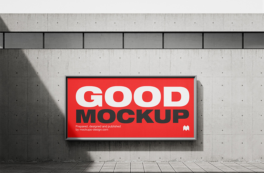
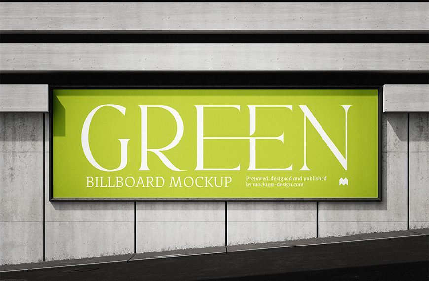
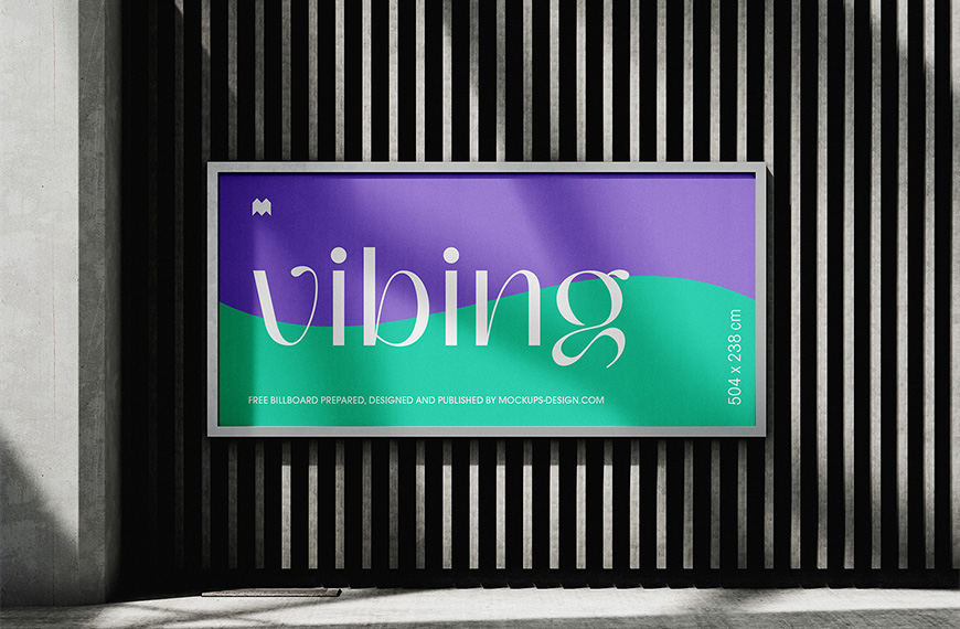
Color contrast refers to the distinction between different colors in a design. It plays a crucial role in grabbing the viewer’s attention, conveying the intended message, and ensuring readability. In the context of billboard design, where the goal is to capture the audience’s attention from a distance, effective color contrast is paramount. Poor color choices can result in a design that is easily overlooked or fails to communicate its message clearly.
Billboard Mockups as Testing Grounds for Color Contrast
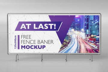
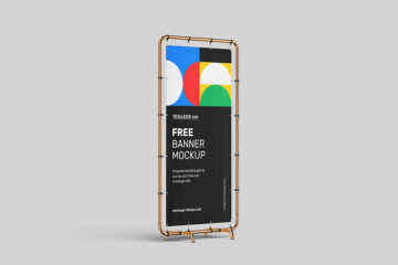
Billboard mockups provide graphic designers with a unique opportunity to test and refine color contrast in a realistic setting. These mockups simulate the appearance of designs on large outdoor billboards, enabling designers to assess how color choices interact on a grand scale. By visualizing designs in context, designers can make informed decisions about color combinations that ensure optimal visibility and impact.
Evaluating Readability and Visibility
One of the primary considerations when testing color contrast in billboard design is readability. The contrast between text and background colors directly influences the ease with which viewers can read the message. Billboard mockups allow designers to evaluate the readability of text from various distances, ensuring that the information remains clear and legible even when viewed from afar.
Color contrast affects the overall visibility of the billboard.
High-contrast color schemes can enhance visibility, making the design stand out against its surroundings. Graphic designers can use mockups to experiment with different color combinations and find the optimal balance that maximizes visibility and impact.
Enhancing Brand Recognition
Color plays a crucial role in brand recognition, making it essential for designers to maintain consistency across various mediums. Billboard mockups enable designers to test how brand colors perform in an outdoor, large-scale environment. This process ensures that the brand remains recognizable and maintains its identity even in the bustling visual landscape of billboards.
Considering Environmental Factors
Billboard mockups also allow graphic designers to consider environmental factors that may affect color perception. Natural lighting, weather conditions, and the surrounding environment can influence how colors are perceived. By testing color contrast in mockups, designers can anticipate these environmental factors and adjust their color choices accordingly to maintain visibility and legibility.
Conclusion
In the world of billboard design, where capturing attention and conveying a message quickly is paramount, color contrast holds significant importance. Billboard mockups serve as invaluable tools for graphic designers, providing a testing ground to evaluate and refine color choices in a realistic context. By meticulously examining color contrast in mockups, designers can ensure that their billboard designs not only grab attention but also effectively communicate their intended messages to a broad audience.
| Author | Mockups Design |
| File Type | .psd |
| Layered | Yes |
| Smart-Object | Yes |
| License | Commercial Use |