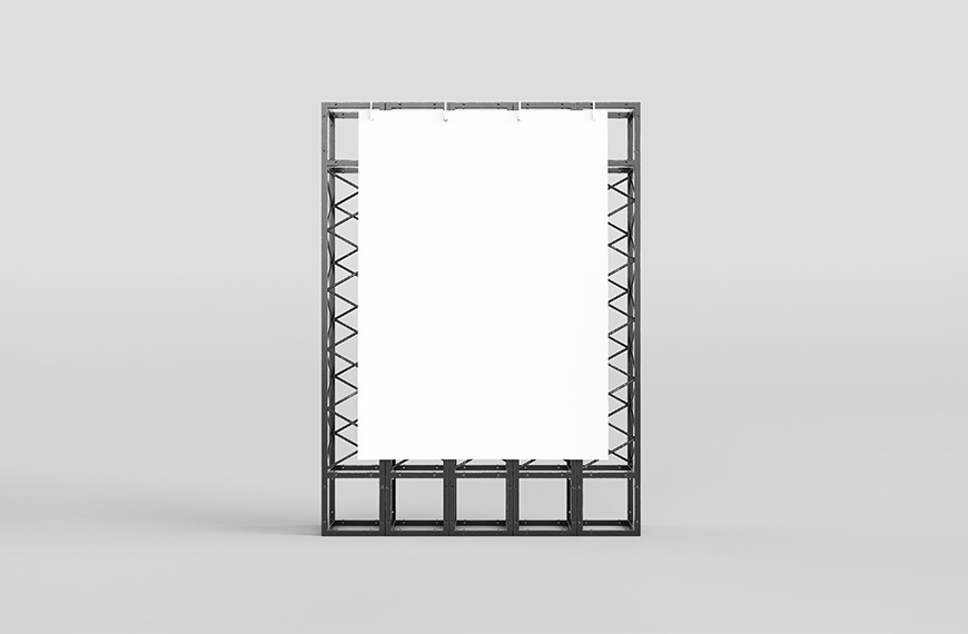
As graphic designers, one of the most critical aspects of our work involves the evaluation of color, especially when creating banner mockups for print media. In the realm of graphic design, colors play a pivotal role in conveying messages, eliciting emotions, and capturing attention. However, the translation of digital designs into print requires meticulous consideration and evaluation to ensure the desired outcome. In this blog post, we will delve into the importance of evaluating color in print media, particularly concerning banner mockups, and discuss essential tips for graphic designers to achieve optimal results.
Understanding Color Reproduction: Color reproduction is the process by which colors are translated from digital screens to physical prints. It involves various factors such as color profiles, printing techniques, paper types, and environmental conditions. Unlike digital displays, which emit light, print media reflects light, leading to differences in color perception.
The Importance of Accurate Color Evaluation: Accurate color evaluation is paramount to ensure that the final printed banners match the intended design and convey the desired message effectively. Failure to evaluate colors properly can result in inconsistencies, color shifts, and dissatisfaction with the final output. Therefore, graphic designers must employ effective strategies to evaluate colors in print media.
Tips for Evaluating Color in Print Media
Use Color Management Systems (CMS): Color management systems help maintain consistency across different devices and ensure accurate color reproduction. By calibrating monitors, printers, and other devices, designers can minimize discrepancies and achieve more predictable results.
Request Print Proofs: Requesting print proofs allows designers to assess how colors will appear in the final printed banners. Print proofs provide a tangible representation of the design, allowing for adjustments before mass production. It is essential to review print proofs under various lighting conditions to simulate real-world scenarios.
Consider Color Profiles: Understanding color profiles is crucial for achieving consistent and accurate color reproduction. Designers should work with printers that support standard color profiles such as CMYK (Cyan, Magenta, Yellow, Black) for optimal results in print media.
Perform Color Correction: In some cases, color correction may be necessary to ensure that the printed banners closely match the digital design. This process involves adjusting color values, saturation, and contrast to achieve the desired appearance. Designers can use software tools like Adobe Photoshop or Illustrator for precise color adjustments.
Evaluate Under Different Lighting Conditions: Colors may appear differently under various lighting conditions, such as natural light versus artificial light. Designers should evaluate print proofs under different lighting setups to anticipate how colors will appear in different environments.
Conclusion
Evaluating color in print media is a critical aspect of creating banner mockups for graphic designers. By understanding color reproduction principles, employing effective evaluation techniques, and collaborating closely with printers, designers can ensure that their designs are accurately translated into the final printed banners. With careful attention to detail and adherence to best practices, graphic designers can achieve stunning results that captivate audiences and deliver impactful messages through print media.
| Author | Mockups Design |
| File Type | .psd |
| Layered | Yes |
| Smart-Object | Yes |
| License | Commercial Use |